Project background
Entertainment lighting brand SIWELO needed a recognisable visual identity that would hold together across sales, marketing and events.

CASE STUDY / Brand visual identity
A visual identity for entertainment lighting brand SIWELO, from an updated logo and guidelines to the identity manual and product catalogues.
Discuss a similar project
Entertainment lighting brand SIWELO needed a recognisable visual identity that would hold together across sales, marketing and events.
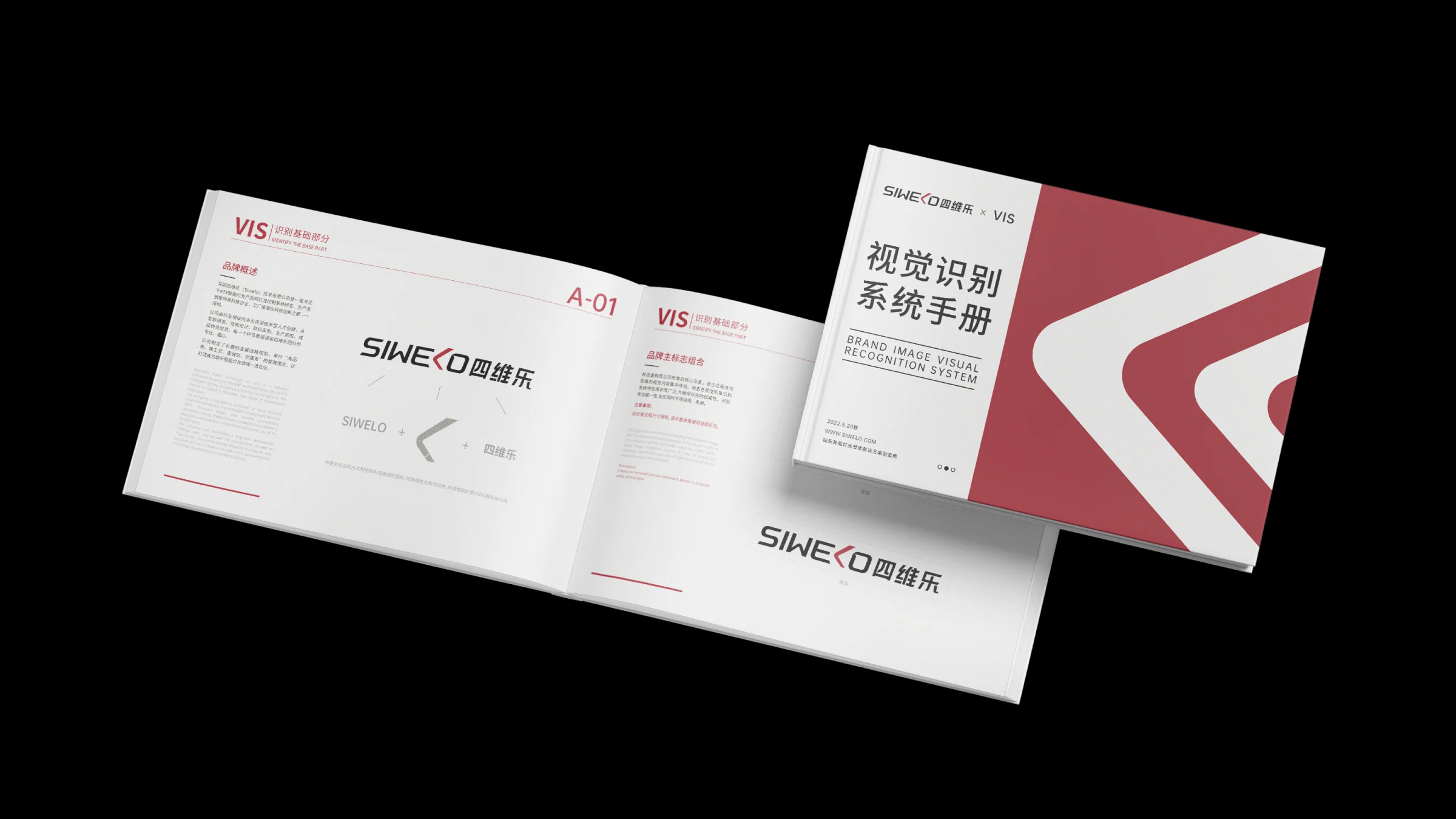
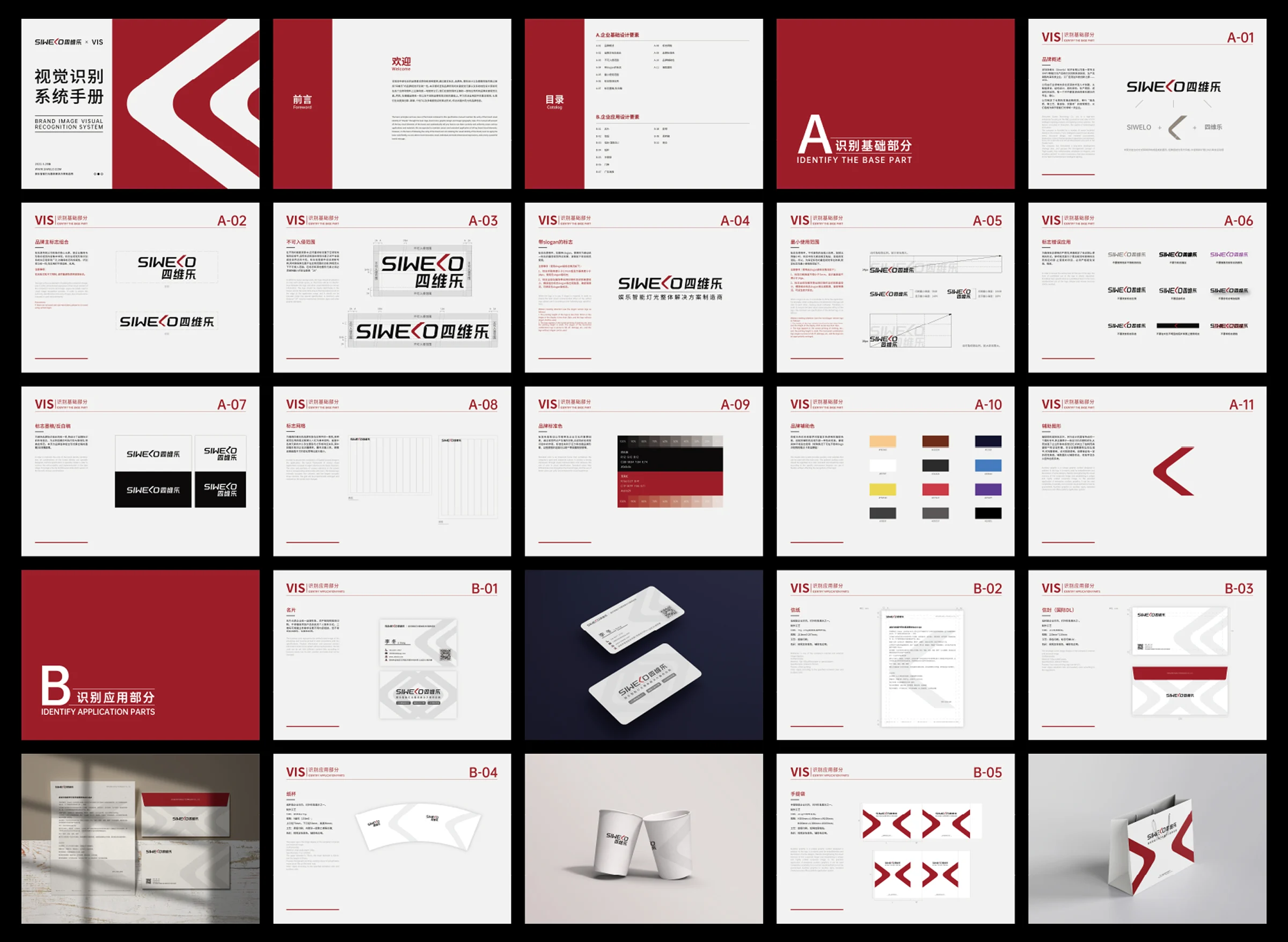
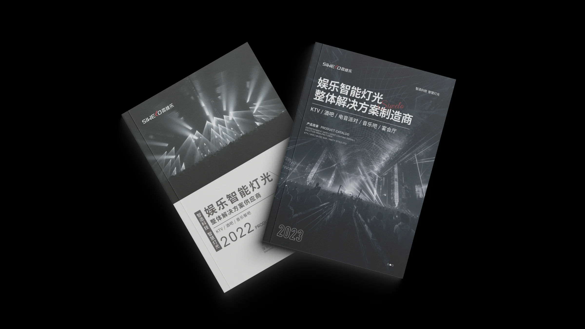
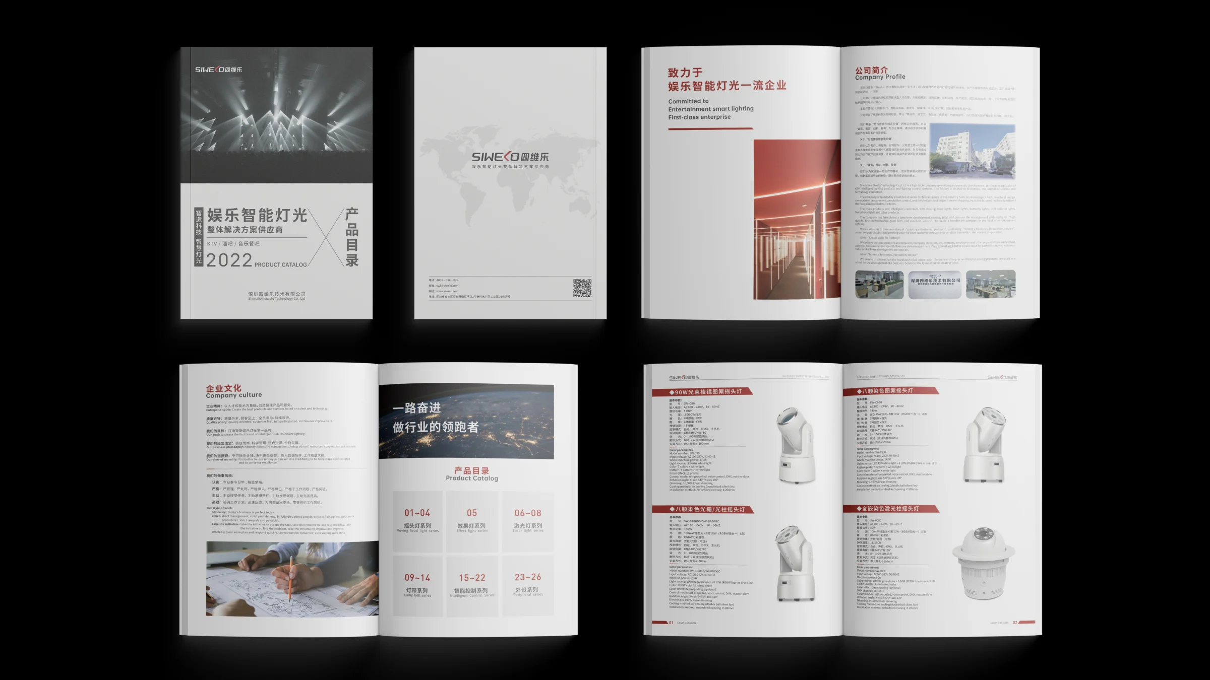
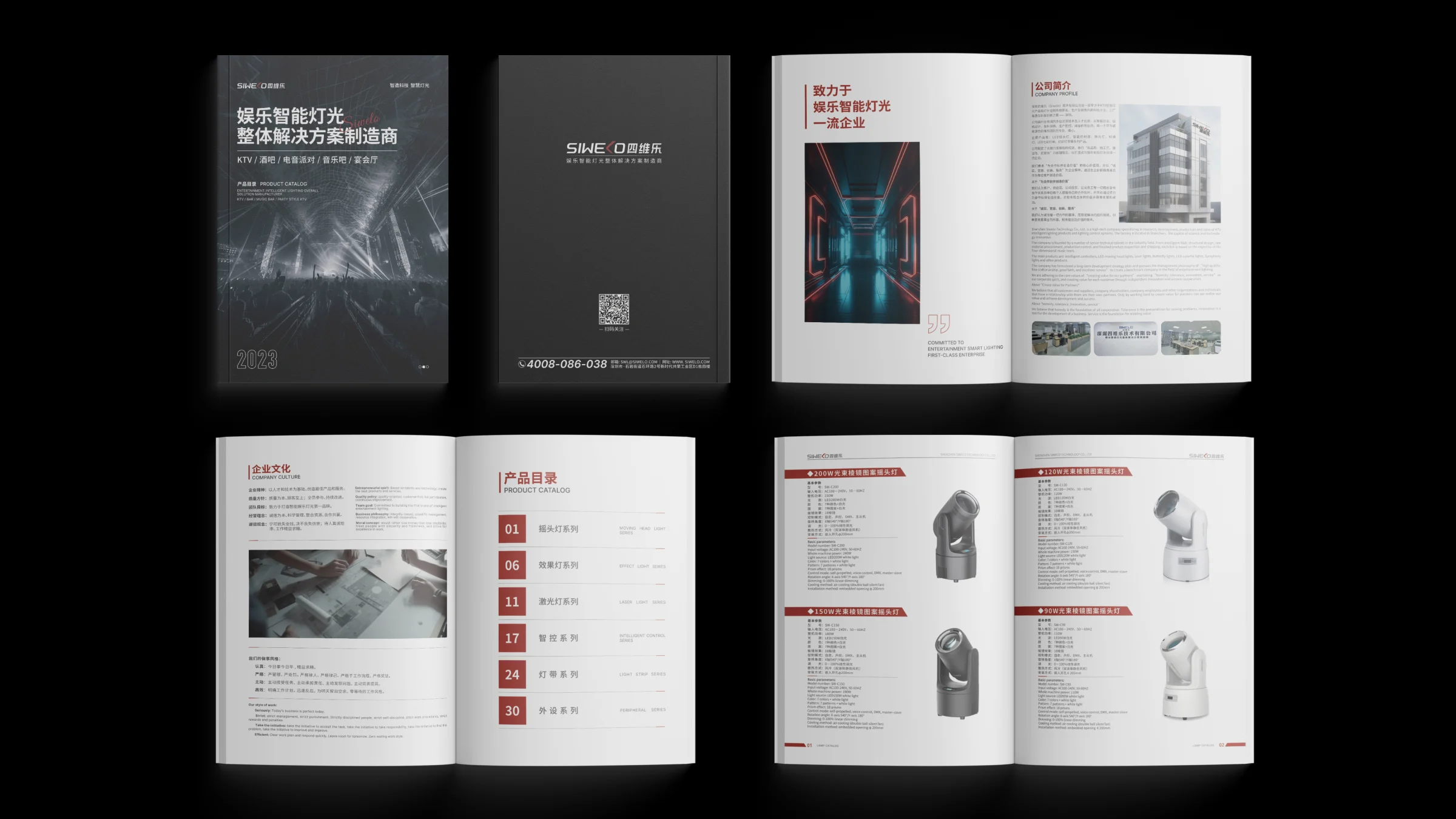
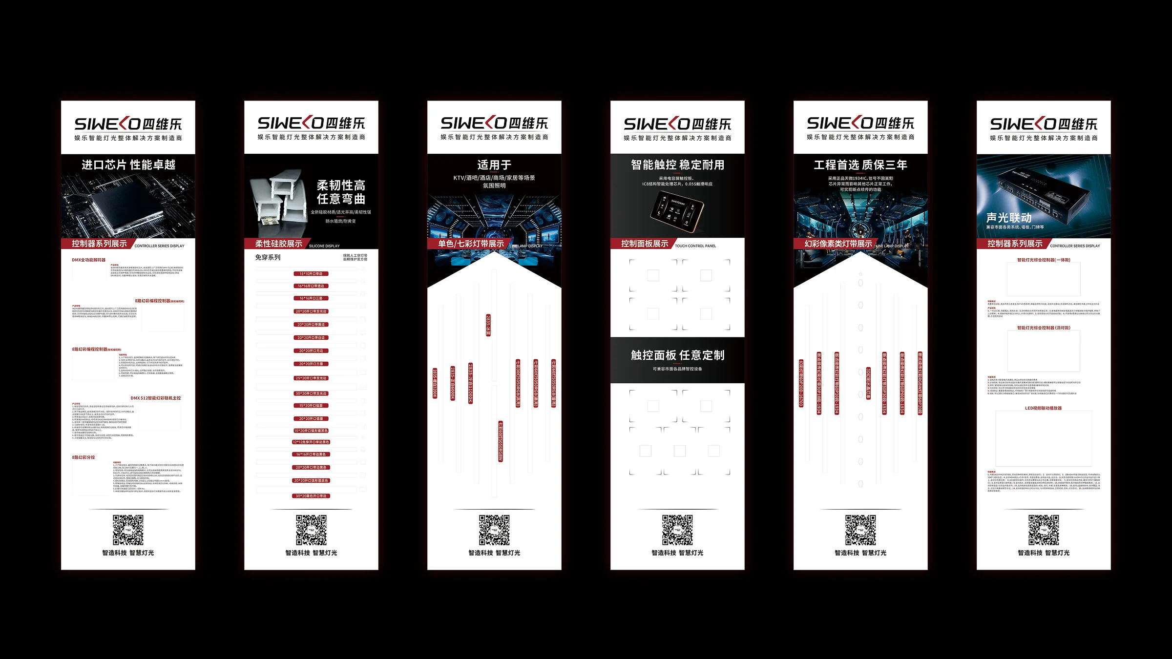
We updated the logo and set rules for colour, typography and layout, then applied them to the identity manual and product catalogues.
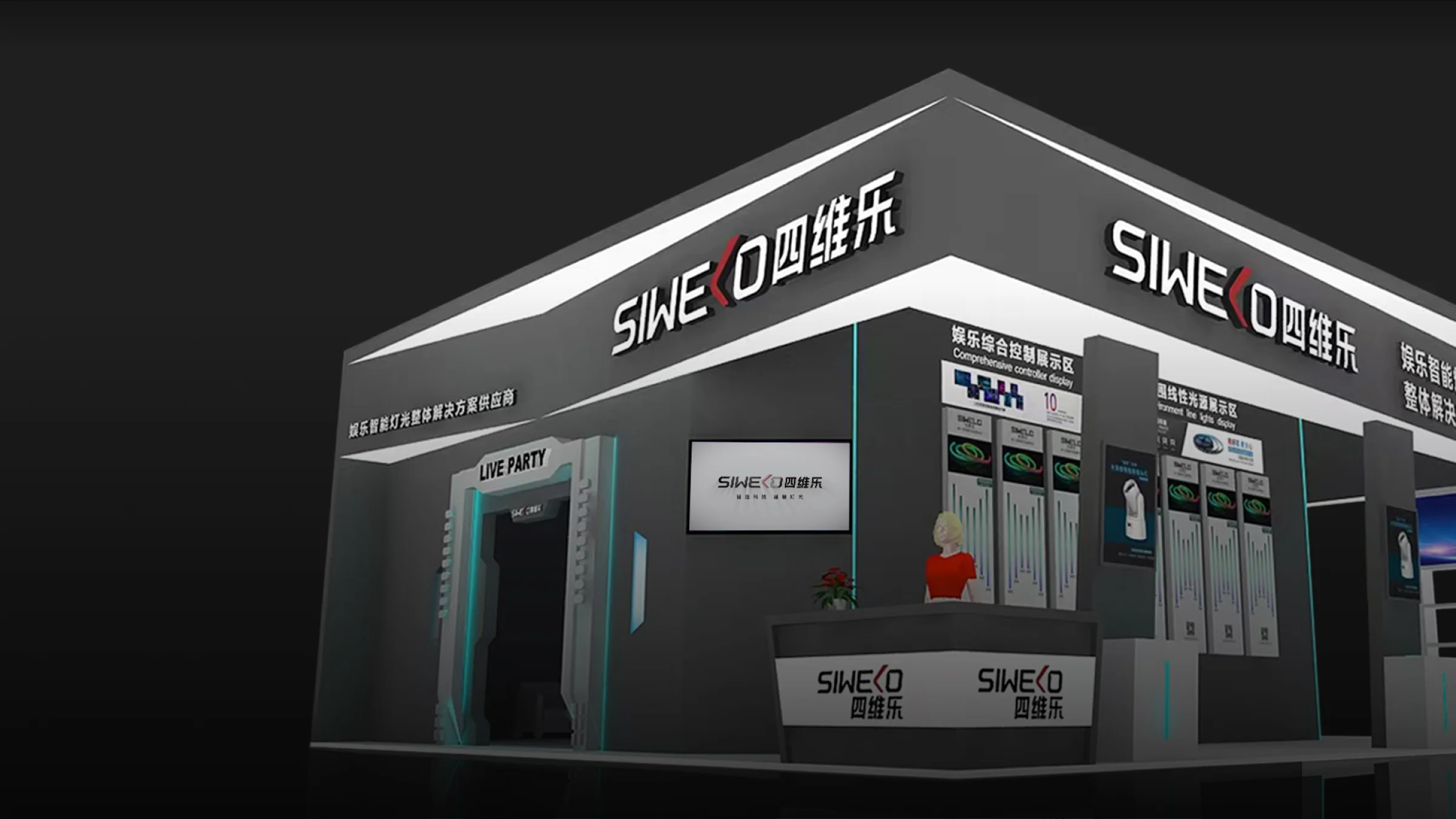
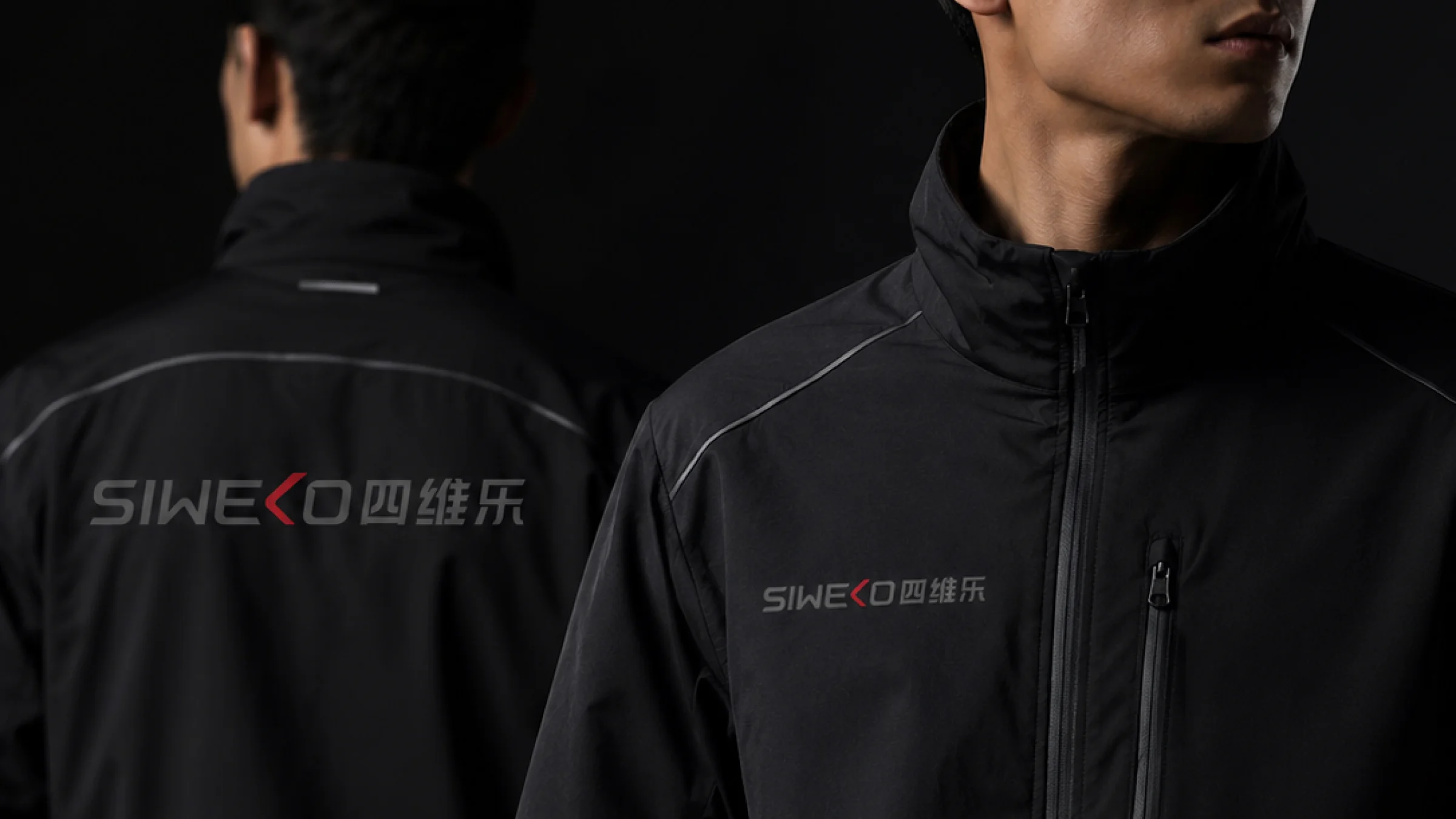
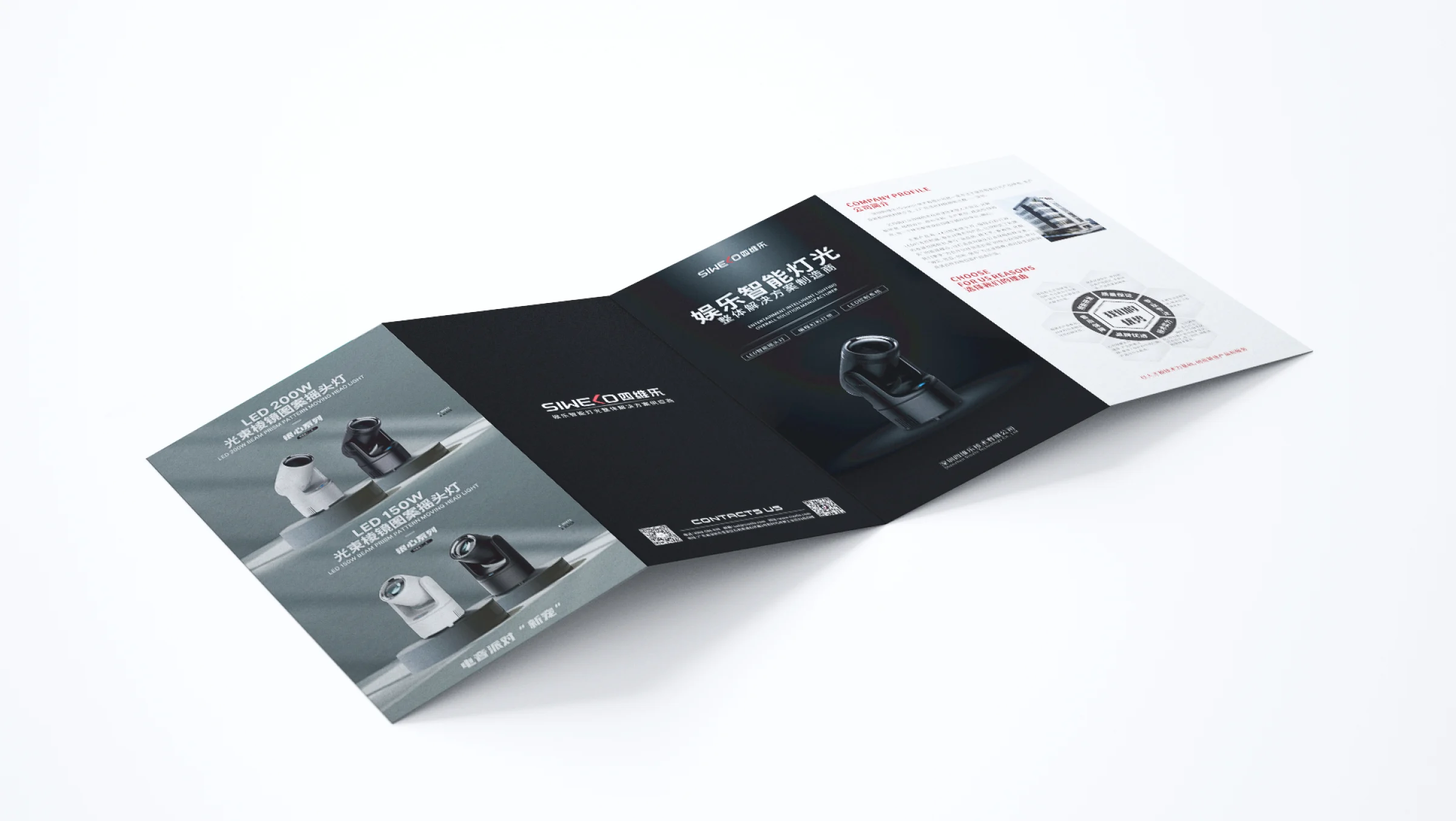
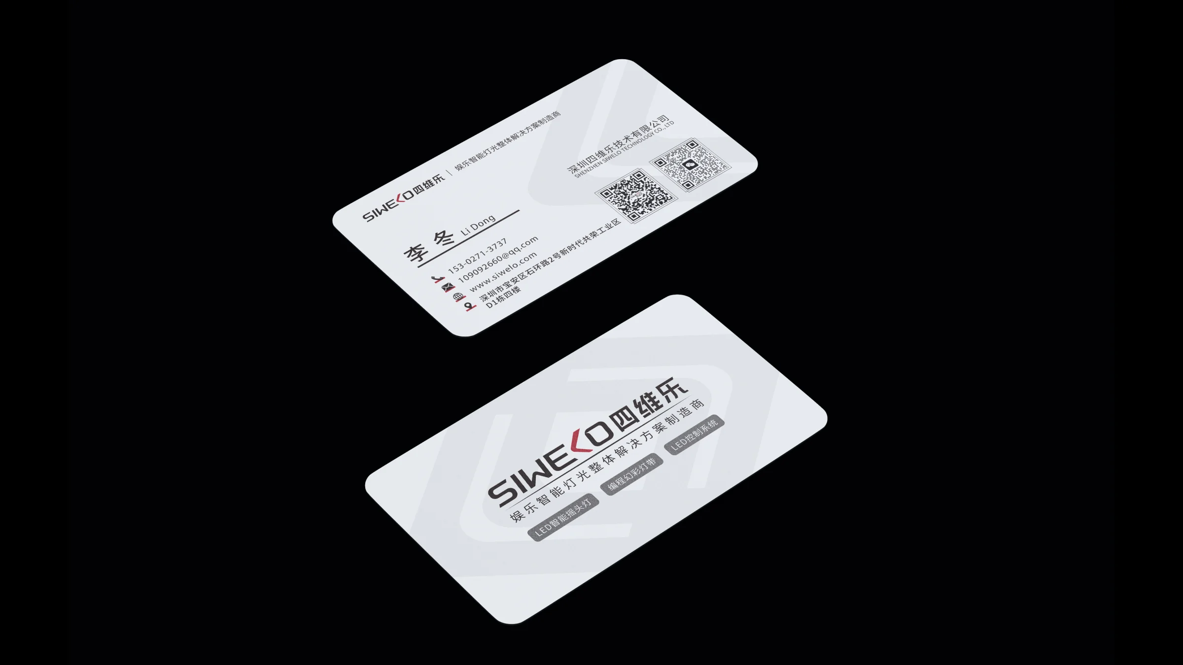
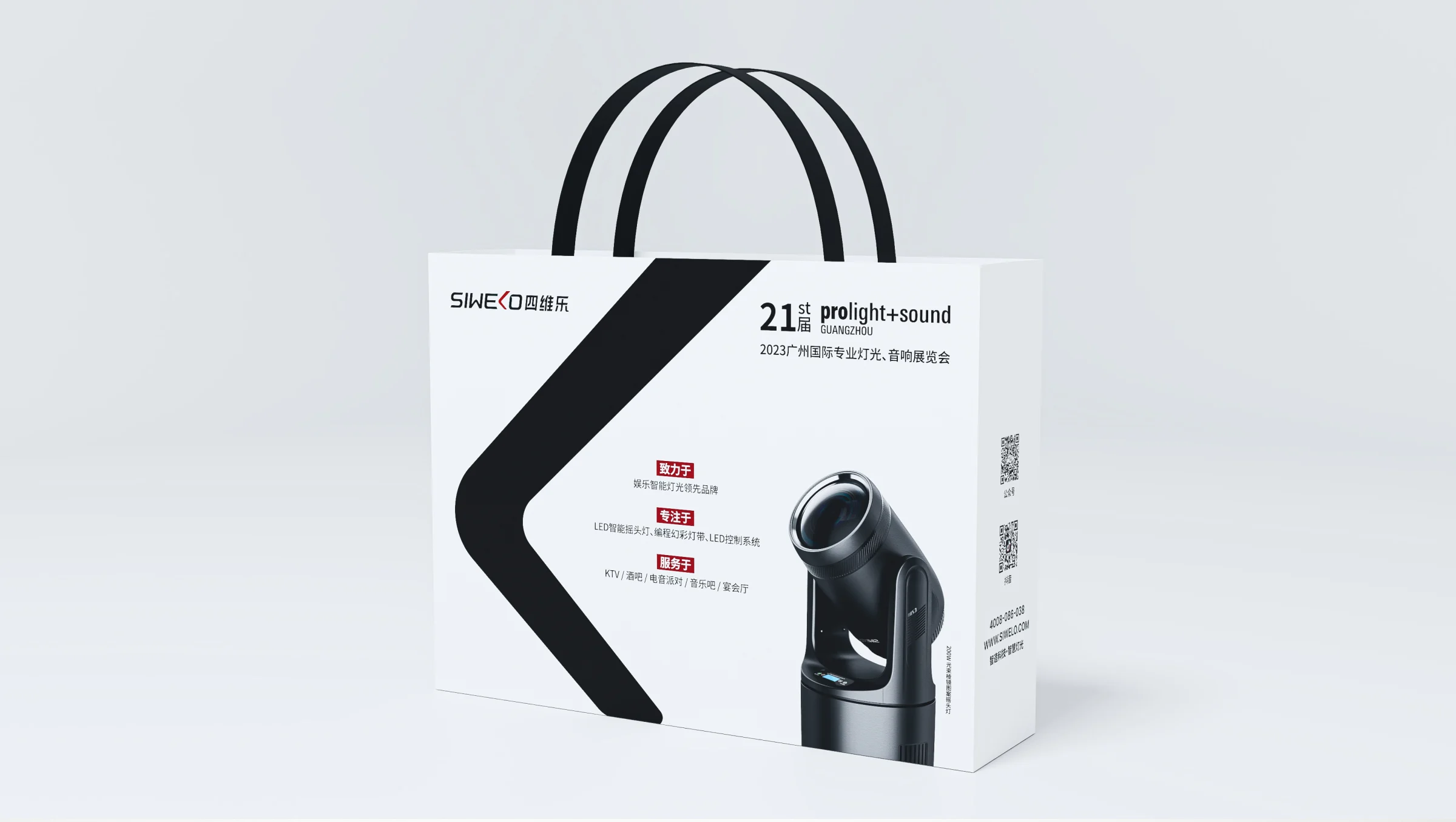
The system extends to the exhibition booth, brochures, business cards, tote bags, displays and campaign posters.
DESIGN APPROACH
Draw the visual system's foundations from brand values, product traits and the intended audience.
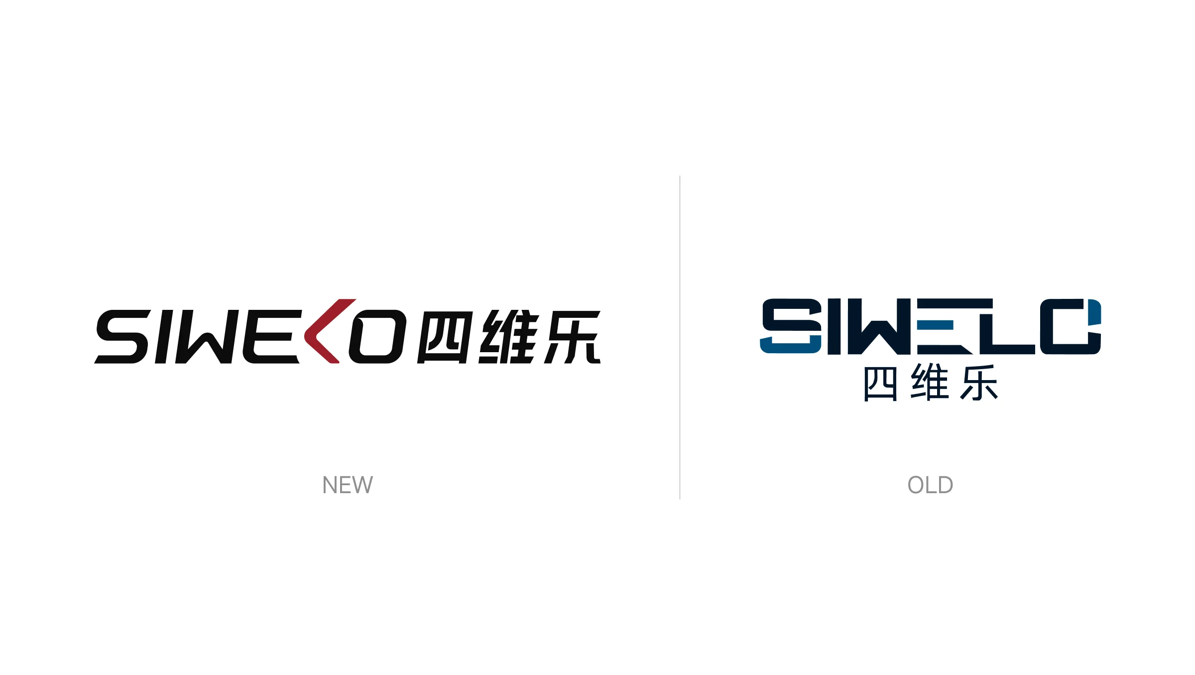
Combine lighting references with an abstract shape and update the Chinese and English logo lockups.
Define primary, supporting and functional colours and show how to combine them across applications.
Set rules for pairing Chinese and English type so hierarchy and readability stay consistent across platforms.
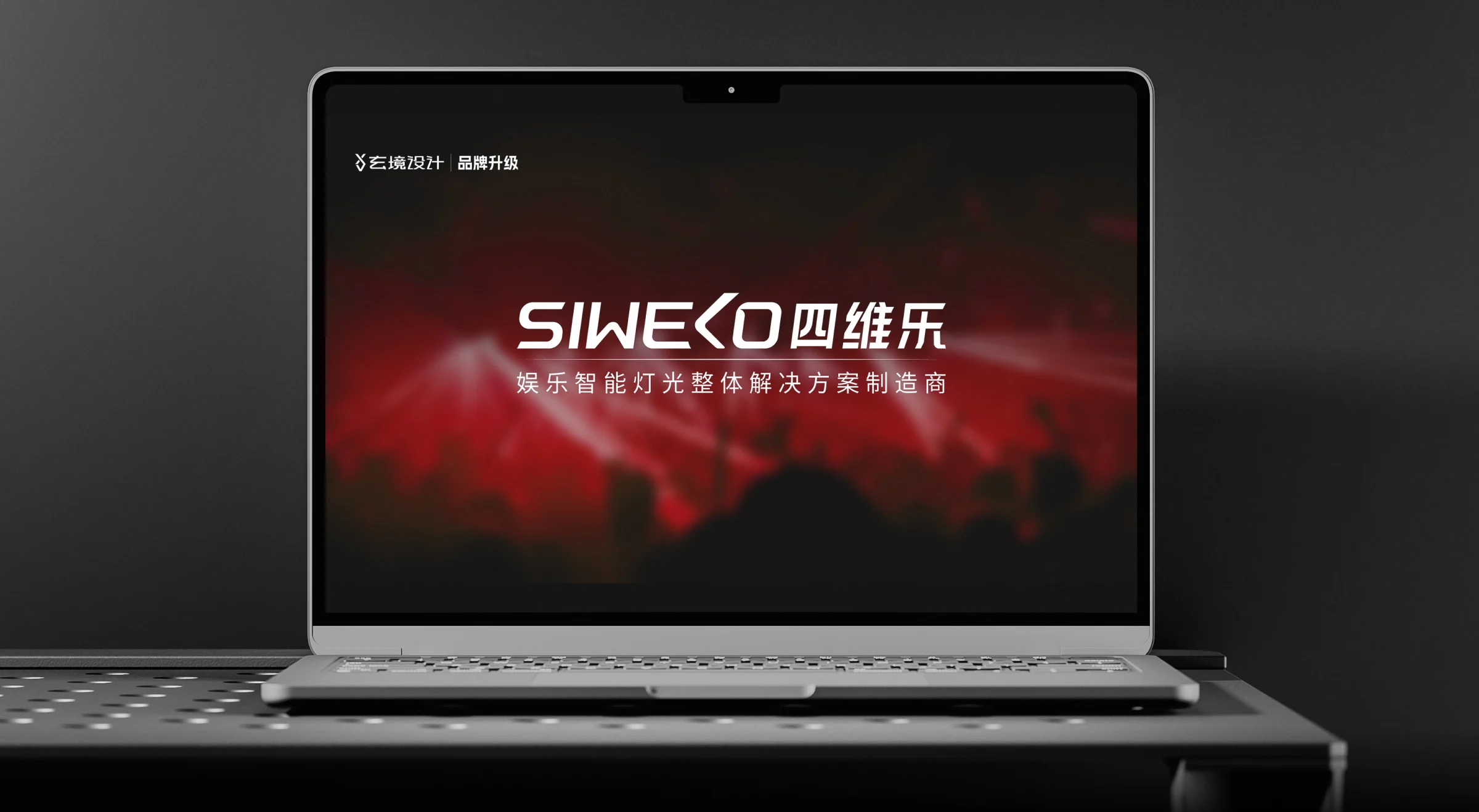
Apply the identity to packaging, exhibition materials, online stores and social media.
Document the visual identity so internal teams and external partners can apply it consistently.
A red angled detail evokes lighting. The new Chinese and English wordmarks are shown side by side.
The identity manual documents logo, colour and typography usage.
The same identity carries through the booth fascia, reception counter and displays.
LET’S TALK
Tell us about your brand, goals and timeline so we can discuss how to help.