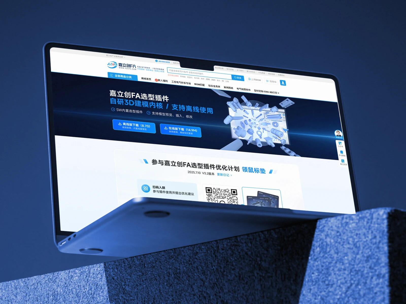
Project background
JLC FA needed a consistent exhibition presence across lightboxes, flyers and brochures, with different viewing distances and amounts of information.

CASE STUDY / Exhibition and print design
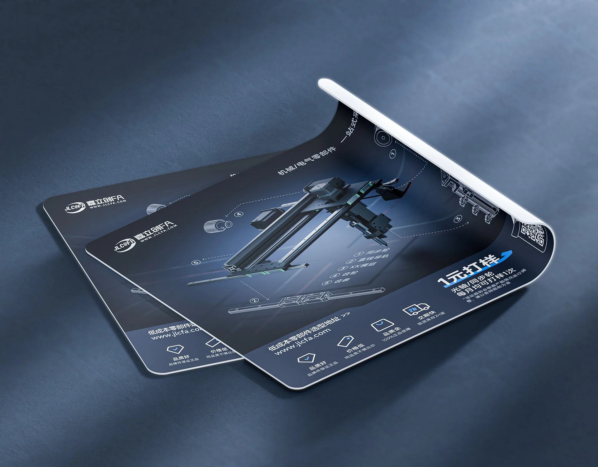
A coordinated visual system for JLC FA's exhibition lightboxes, product flyers and brochures, presenting products, tools and services across formats.
Discuss a similar project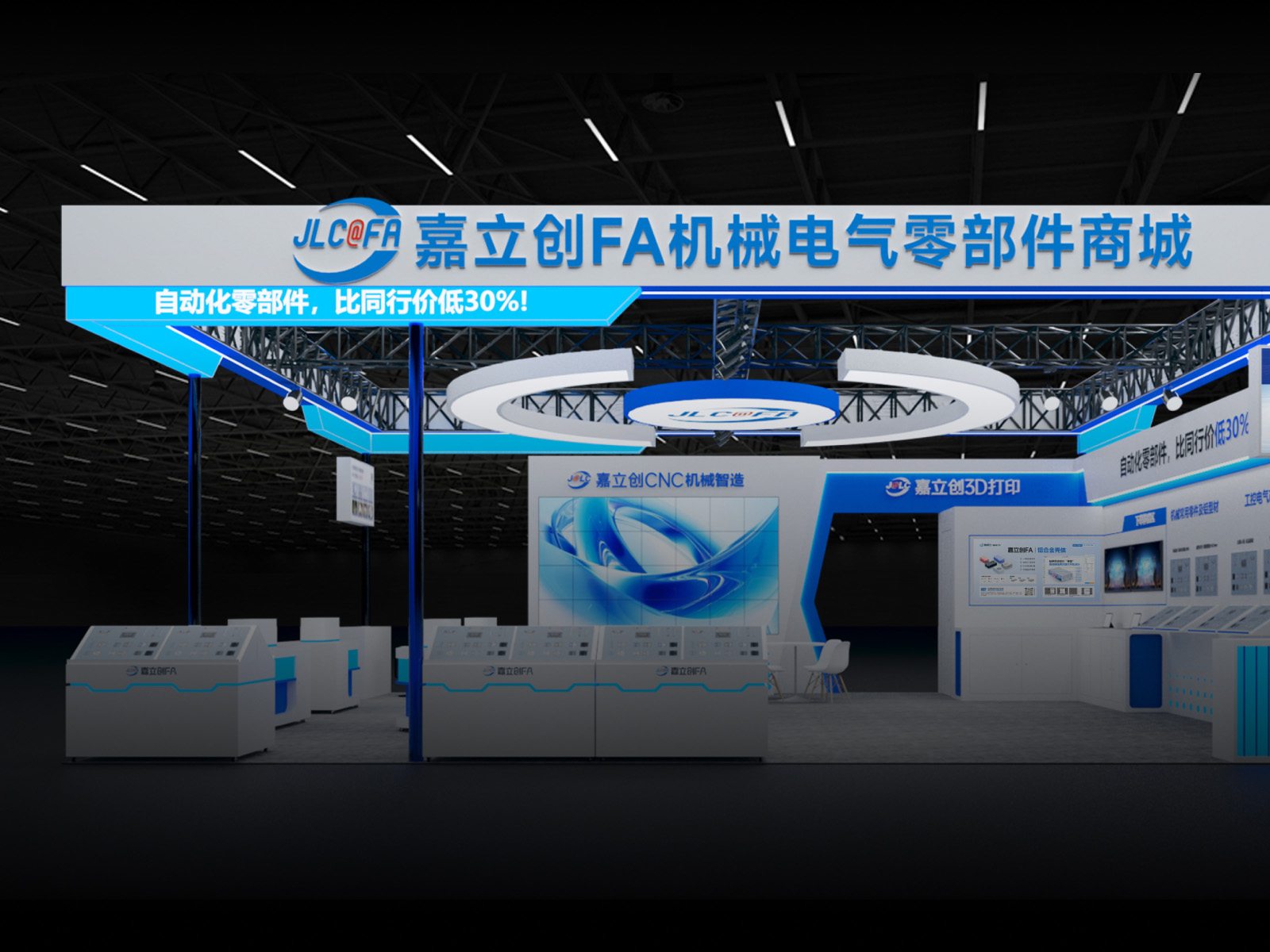
JLC FA needed a consistent exhibition presence across lightboxes, flyers and brochures, with different viewing distances and amounts of information.
A common blue-and-white palette and hierarchy organised product features, tool information and inquiry prompts across the formats.
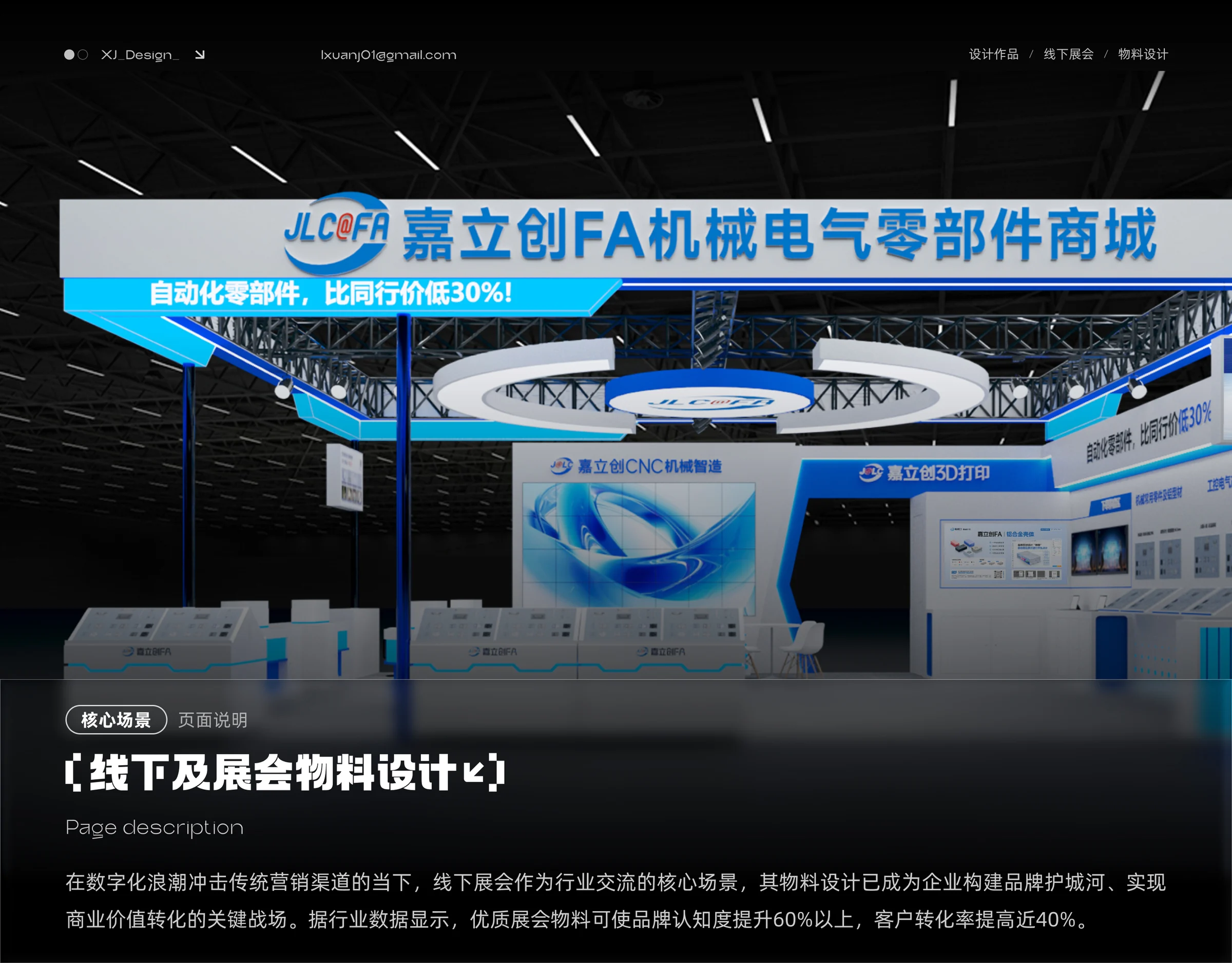
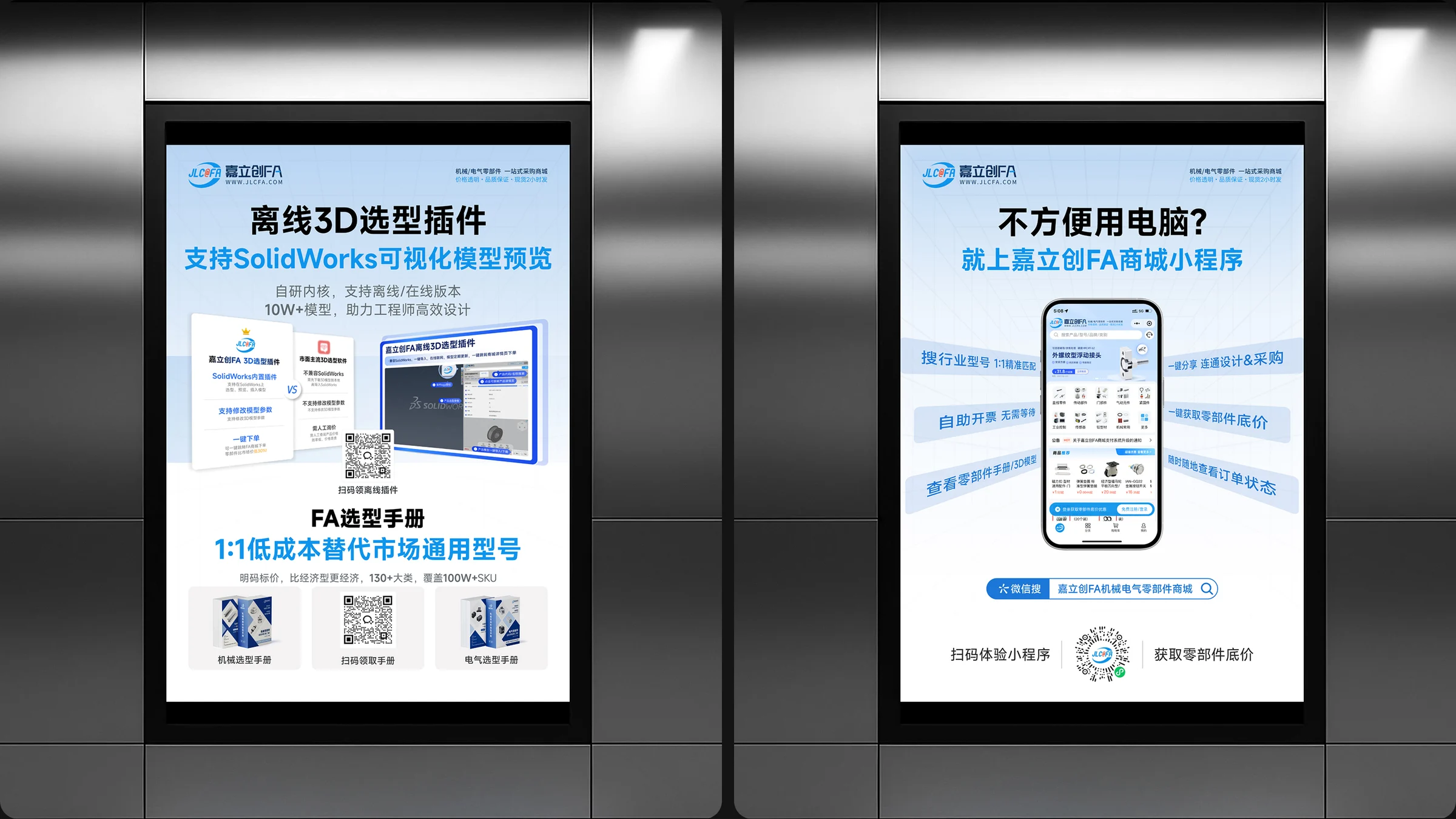
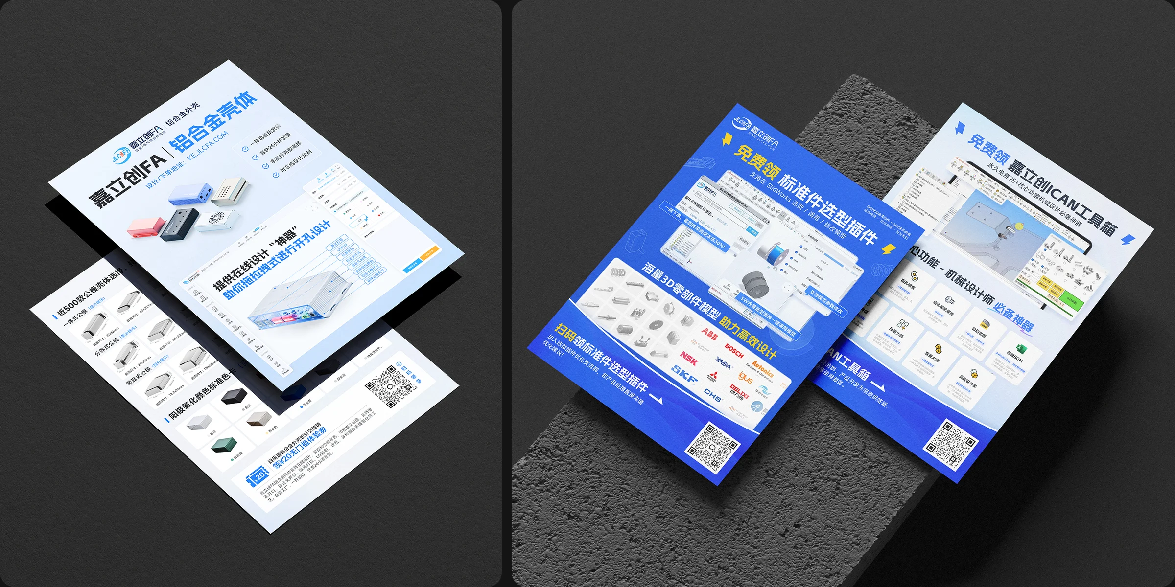
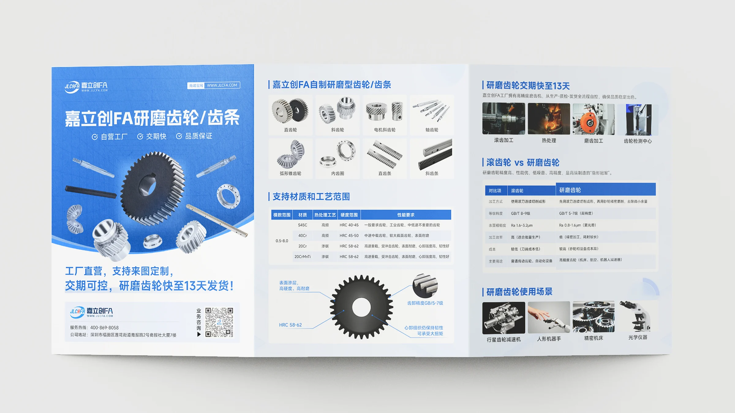
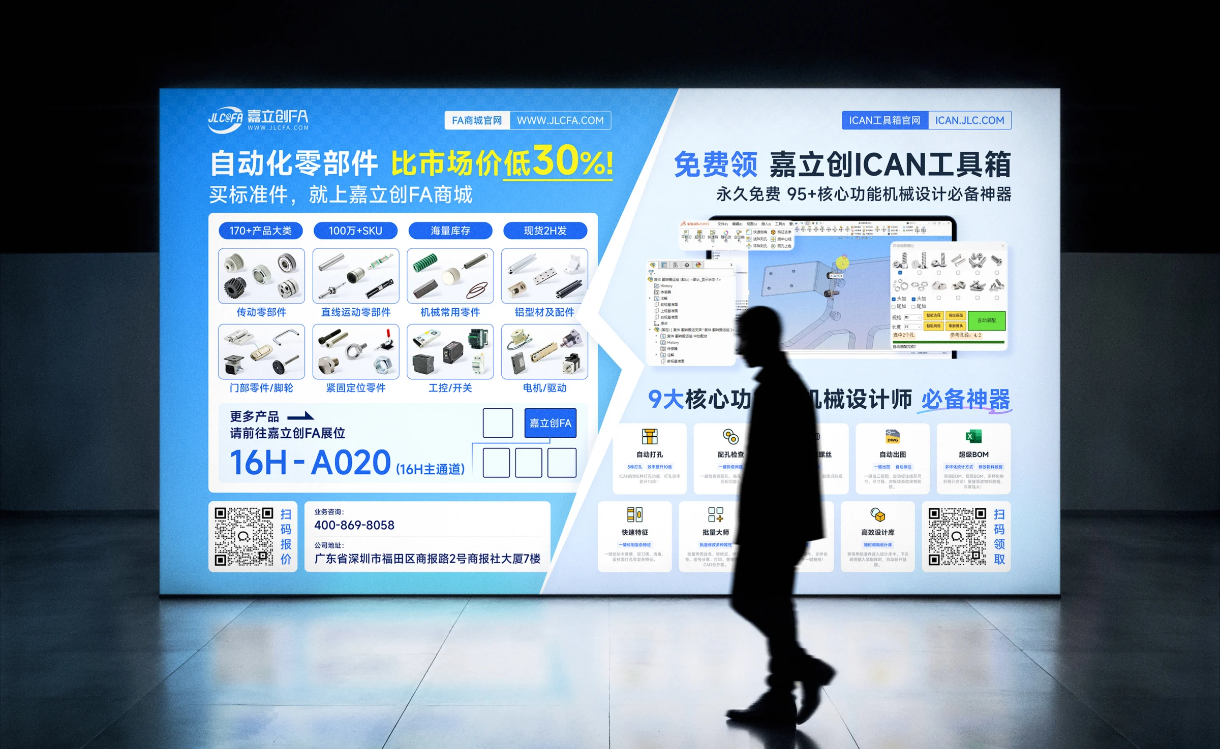
The project covers booth graphics, lightbox posters, flyers and folded brochures.
DESIGN APPROACH
A common blue-and-white palette and consistent logo placement tie the exhibition materials together.
Separate titles, benefits, specifications and consultation details so they work at a distance and up close.
Use the same identity across lightboxes, flyers and brochures while adapting to the format and reading order.
LET’S TALK
Tell us about your brand, goals and timeline so we can discuss how to help.